Once a new page has been added, you can use the Drag & Drop Page Builder to customise the content and layout of your page. Whether you're editing a template or building your own, the options are the same, giving you control over the items in the page and how they are presented.
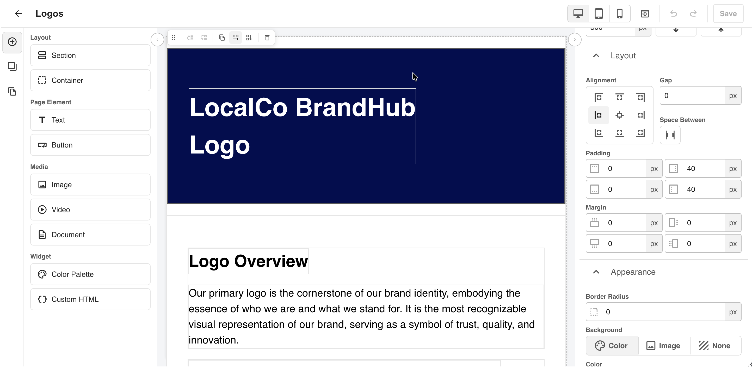
Click on the headings below to find out more about each key feature in your Page Builder.
Table of Contents
Page Builder
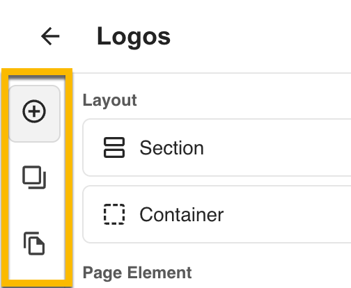
The Page Builder has three areas:
- Left control panel. This is organised into 3 main tabs, Elements, Layers and Pages (Highlighted below).
- Elements includes the items you can add to a page, ie Widgets, Layouts, Media & Page Elements like Sections.
- Layers shows the structure of your page: Page, Sections, Containers and Widgets.
- Pages is where you manage your page navigation (see Drag & Drop Page Navigation).
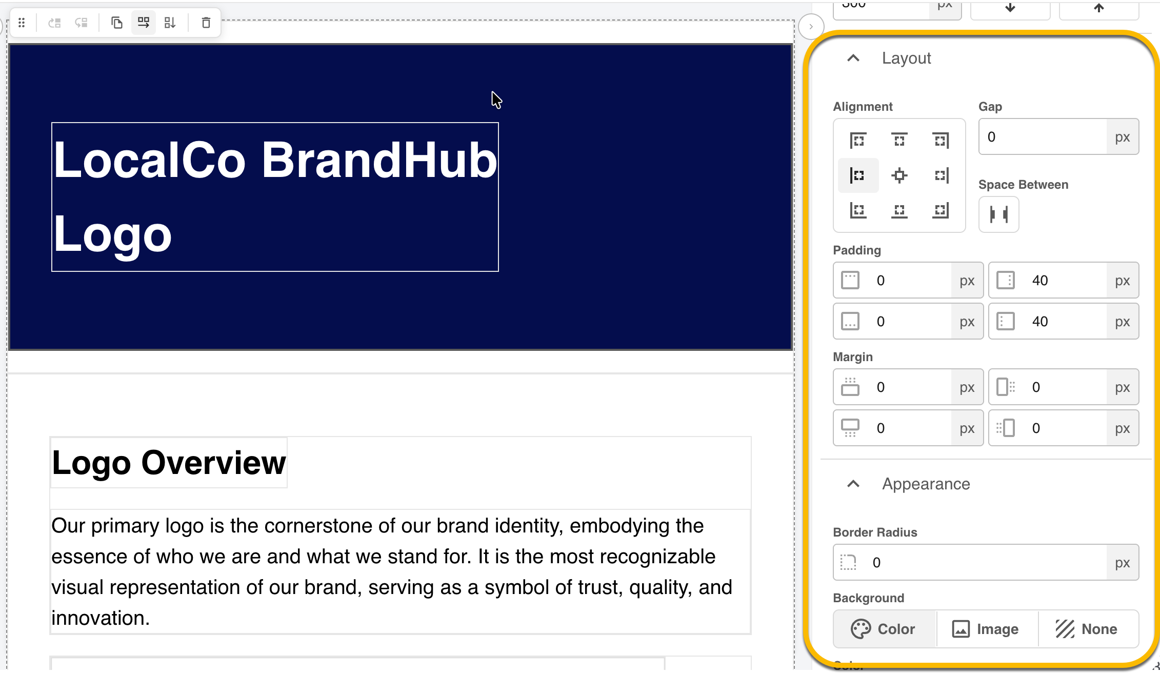
- Canvas (centre): a preview of your page that you can interact with and edit directly.
- Right panel: the settings for whatever you have selected. When you add or select a Page, Section, Container or Widget, its settings and configuration options appear here (highlighted below).
Name & Save your Page
At the top of your page you'll find prompts to name the page and where you can Save it.

You can only click the Save button if changes have been made. Once you Save the page, your changes will automatically be available to any users who can view the page.
Undo and Redo
You can also undo and redo changes while you build. Removing or replacing an image or video can be undone in a single step
Page Properties
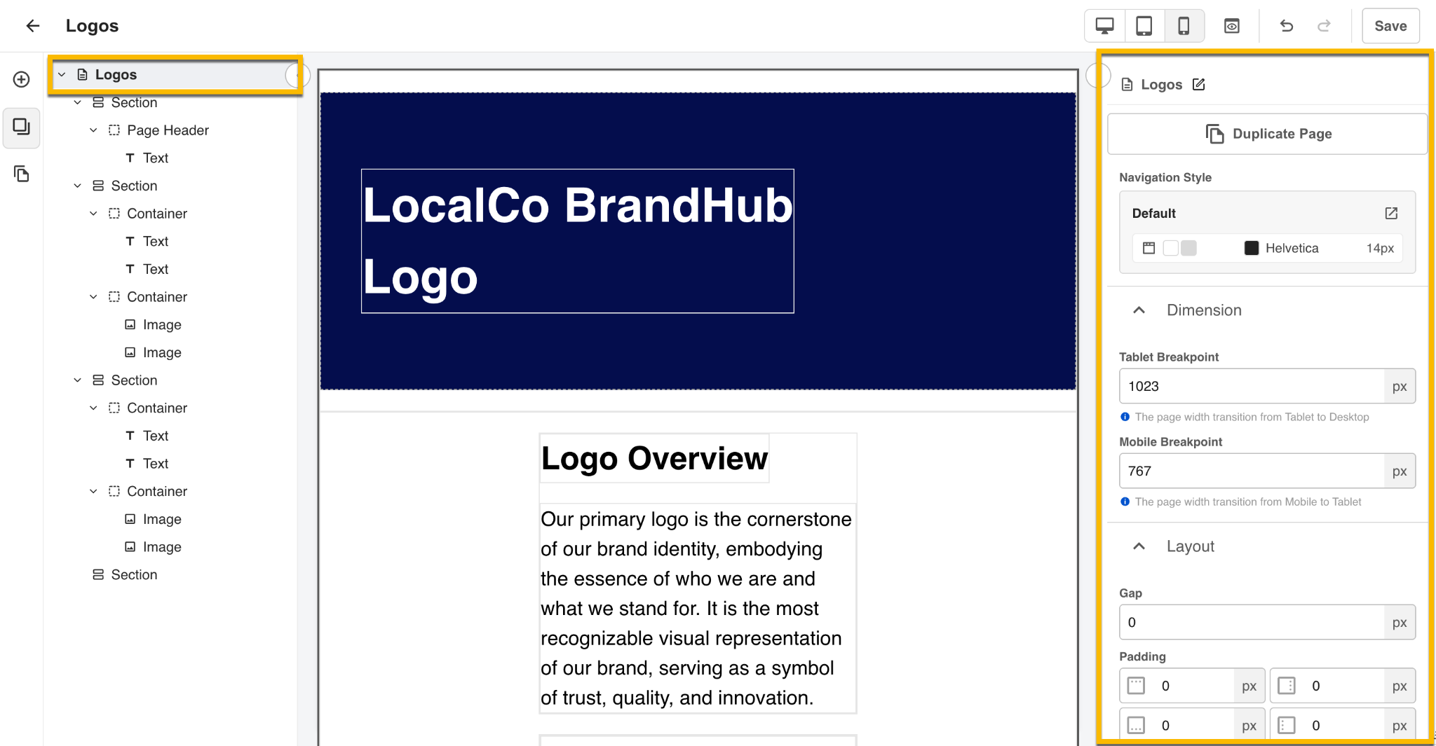
The page itself can have properties applied, including background colour, background image, padding and spacing.
- Select the Page at the top of the Layers panel, or click the page background on the canvas.
- Update the settings in the right panel.
Responsive Breakpoints
Specific to a Page is the option to set a default Tablet Breakpoint and a Mobile Breakpoint, the screen widths at which the Tablet and Mobile views apply. If you leave a field blank, the default is used (Tablet 1023px, Mobile 767px). The Tablet Breakpoint must be greater than the Mobile Breakpoint, otherwise both fields show an error.
Note that for each element you’ll also be able to tailor its behaviour on each view as well, ensuring your widgets and section displays render well for all devices.
Sections & Containers
Sections construct the general page layout by grouping content together. Containers sit inside Sections (and inside other Containers) to arrange your widgets. Pre-configured Sections and Containers are available when you create a page with a Template.
Settings you can customise for both include padding, spacing, background colour and background image (a URL or from your DAM), and whether content flows vertically or horizontally.
- Direction. Set whether the content appears in Rows or in Columns
- Layout. Set the vertical and horizontal alignment of content (for example top, centre, etc). As well as controls around Gaps, Padding and Margins.
- Nesting. You can place up to 3 levels of Containers inside another Container, allowing you to build multi-tier layouts, such as do's and don't’s grids.
- Appearance. Apply unique colors or background images to a section
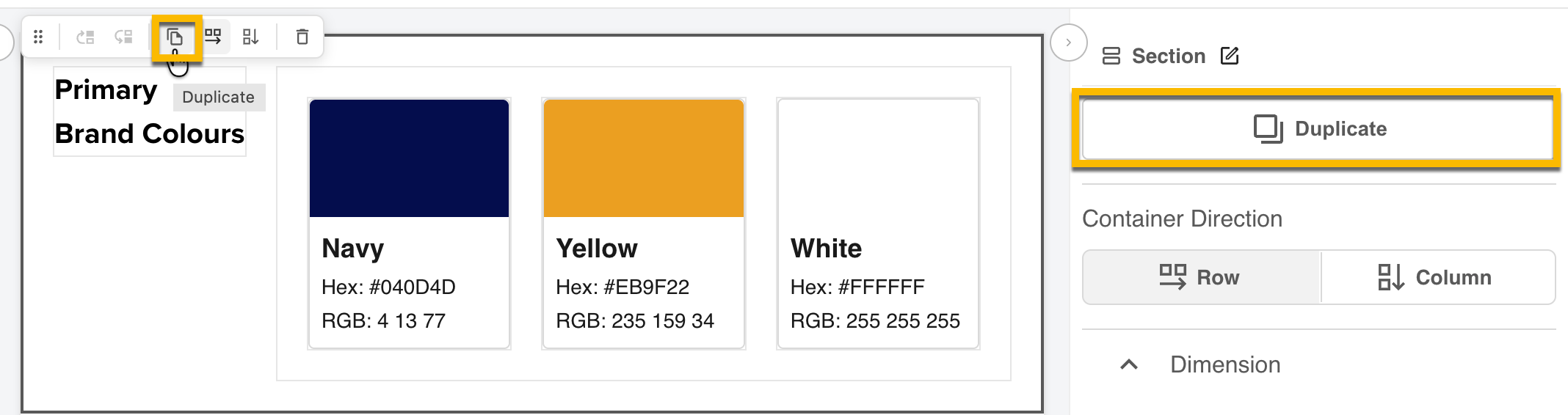
To reuse a layout you can Duplicate a Section or Container, copying all of its widgets and styling (as indicated below).
Widgets
Widgets feature your content and inform users about a specific item or asset. To add a widget, select it in the Widgets tab and drag it into a Section or Container.
All Widgets include options to customise the Layout > Margins and all but the Custom HTML widget also allows you to alter the dimensions. The Dimensions option can also apply to each responsive view, so you can set specific dimensions for Desktop, Tablet and Mobile.
Color Palette Widget
Highlight the colors that are essential to your Brand. Select a color and add a Name. The colour and its Hex and RGB values are automatically generated on the Preview once selected. CMYK codes can also manually be added to the widget once that checkbox is selected.
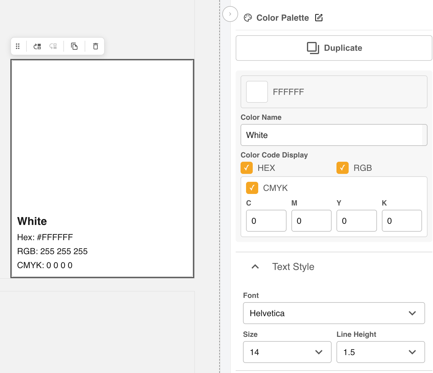
Customize the:
- Background color
- Border color
- Text Font, Size and Line Height of the Name and Codes
- Padding & dimensions
Text Widget
Use the Text Widget to communicate key information and to highlight your Brand Typography.
Most customisation happens on the preview in the center of your screen: click the Text Widget, then edit the text and apply styling with the text toolbar. The available fonts reflect what appears in your Admin area.
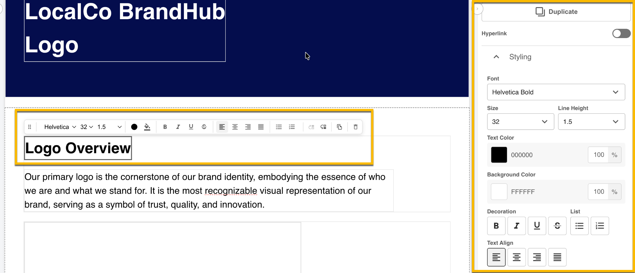
Customize the:
- Standard text styling options like color, size, font, italics, lists, etc.
- Background Color
- Padding & margin
Media Widgets
Images, Videos and Documents can all be added within their unique widgets to ensure users can view relevant assets for Brand Guidelines, in line with permissions.
To add any one of those asset types, users can add via URL or via Select from your DAM. DAM assets follow the same permissions as the folder and stay linked to the folder version, so updates appear on the page automatically.
For each option, Users can customise the Dimensions and Margins of the widget display
Image Widget
Feature images to aid visual storytelling or highlight key assets. When adding the image you can choose the Image Quality, determining if it will show the original image, or a version optimised for web pages.
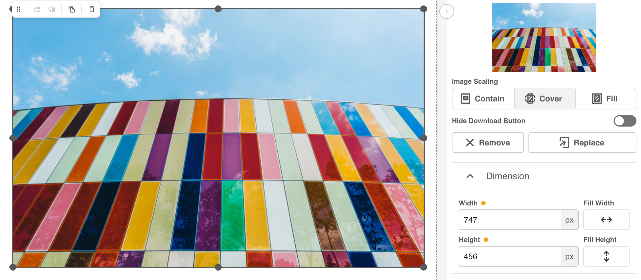
Customize the:
- Image Scaling. Including options to Contain, Cover or Fill the image
- Hide the download icon if the asset isn’t intended for use, noting that when enabled only users with permission can Download.
- Dimensions, Margin and Padding
Video Widget
Custom video options allow you to hide the Download icon, and choose whether the video autoplays when the page loads. Autoplay does not apply inside the Page Builder.
Direct CDN links are supported only when the file type suffix (".mov", ".mp4") are added at the end of the URL.
Document Widget
Document Widgets support PDF and Office documents, with the Download option downloading the original file.
Button Widget
Add a Button Widget to enable navigation to other areas of the platform, other pages or as a prompt to download assets.
Users can customise a number of items for the button itself:
- Add Button Name
- Customise the Colour, font and font size
- Button Background and Border Colors - by default and on Hover
- Border Thickness & Radius
- Button Padding and Margin
Custom HTML Widget
Add your own HTML and CSS for layouts that the standard widgets can't achieve.
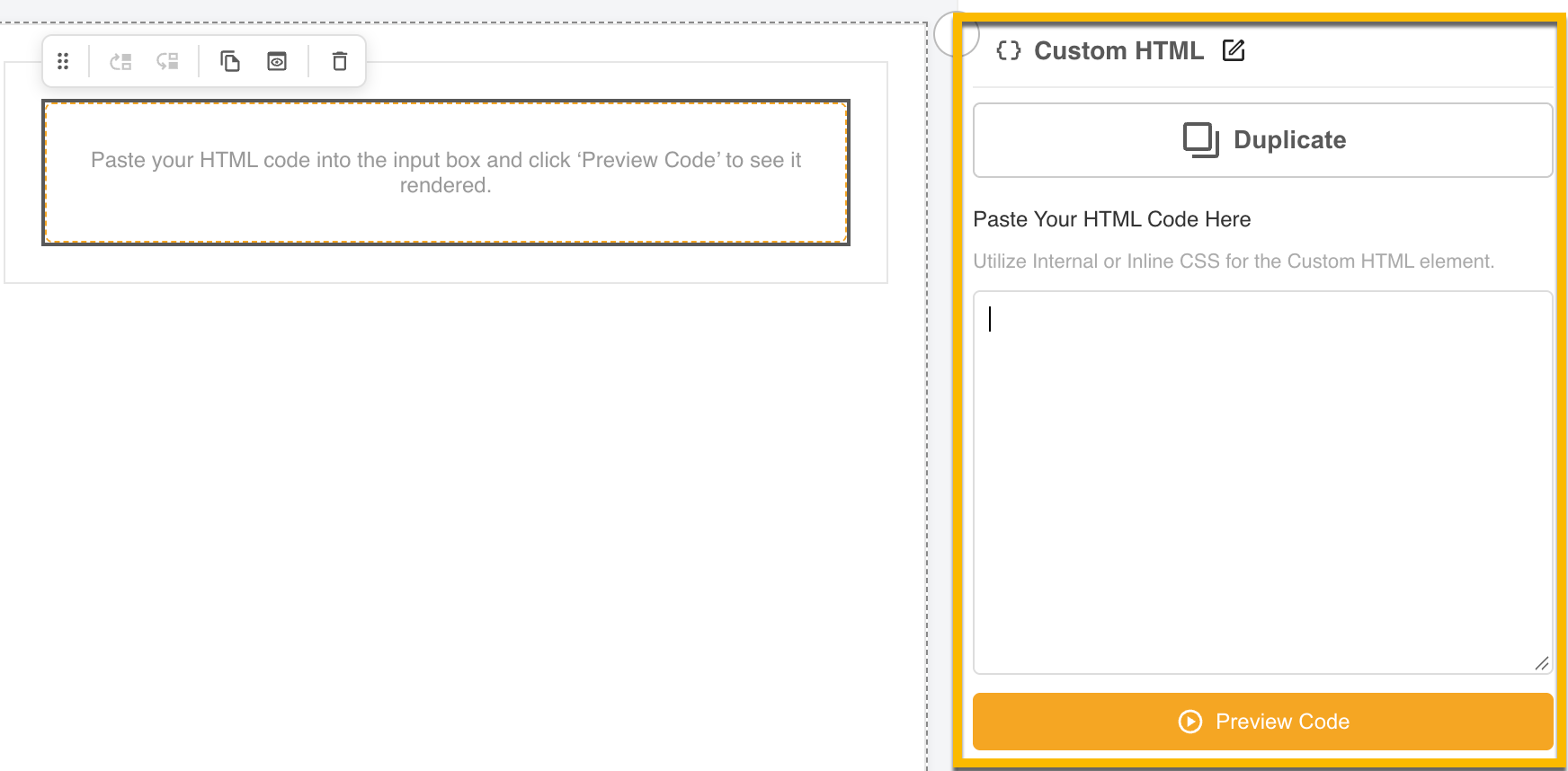
Once your Custom HTML Widget has been added, paste your code in on the right panel (highlighted below) and click Preview Code to view it within your viewer panel.
Layers
Open the Layers tab to see your page as a structure and how your Pages, Sections, Containers and Widgets appear. Select any layer to select it on the canvas and scroll to that item.
You can also rename the Page, Sections, Containers and Widgets to make it easier to locate and navigate when making changes.

Change Device Size
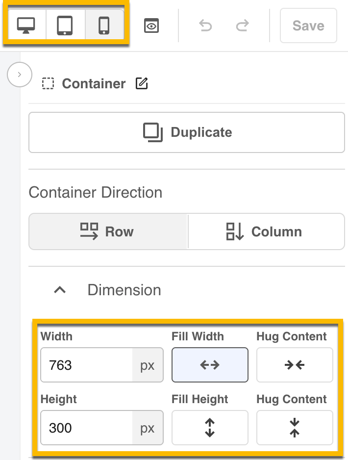
Use the device icons in the top right of the builder to switch between Desktop, Tablet and Mobile. Not only will this update the Preview, allowing you to see what the page will look like in those responsive options, but you can also customise the appearance of each Element for Tablet and Mobile.
The Dimensions you change while in Tablet or Mobile view apply to that device size only, including on the published page. Typically this will involve altering the Width of an element, as highlighted below.
You can read more about this feature here.
You can view the full list of related pages here or view suggested articles below.
Was this article helpful?
That’s Great!
Thank you for your feedback
Sorry! We couldn't be helpful
Thank you for your feedback
Feedback sent
We appreciate your effort and will try to fix the article